Company Summary:
PT2U is a pioneering mobile physical therapy service in Southern Oregon. They are the first in the area to offer insurance-covered mobile PT services, emphasizing convenience, high quality, and dynamic care directly to patients' locations.
PT2U Branding Goals:
Logo Redesign: Create a logo that clearly communicates PT2U’s mobile, dynamic, and high-quality physical therapy services.
Uniform Spacing: Ensure uniform spacing in the logo design to address the current dissatisfaction.
Standout Text: Emphasize the PT2U name to avoid confusion with "PTTOOU."
Express Motion: Incorporate elements that express motion, speed, and dynamic care.


Local Liquids Branding Goals
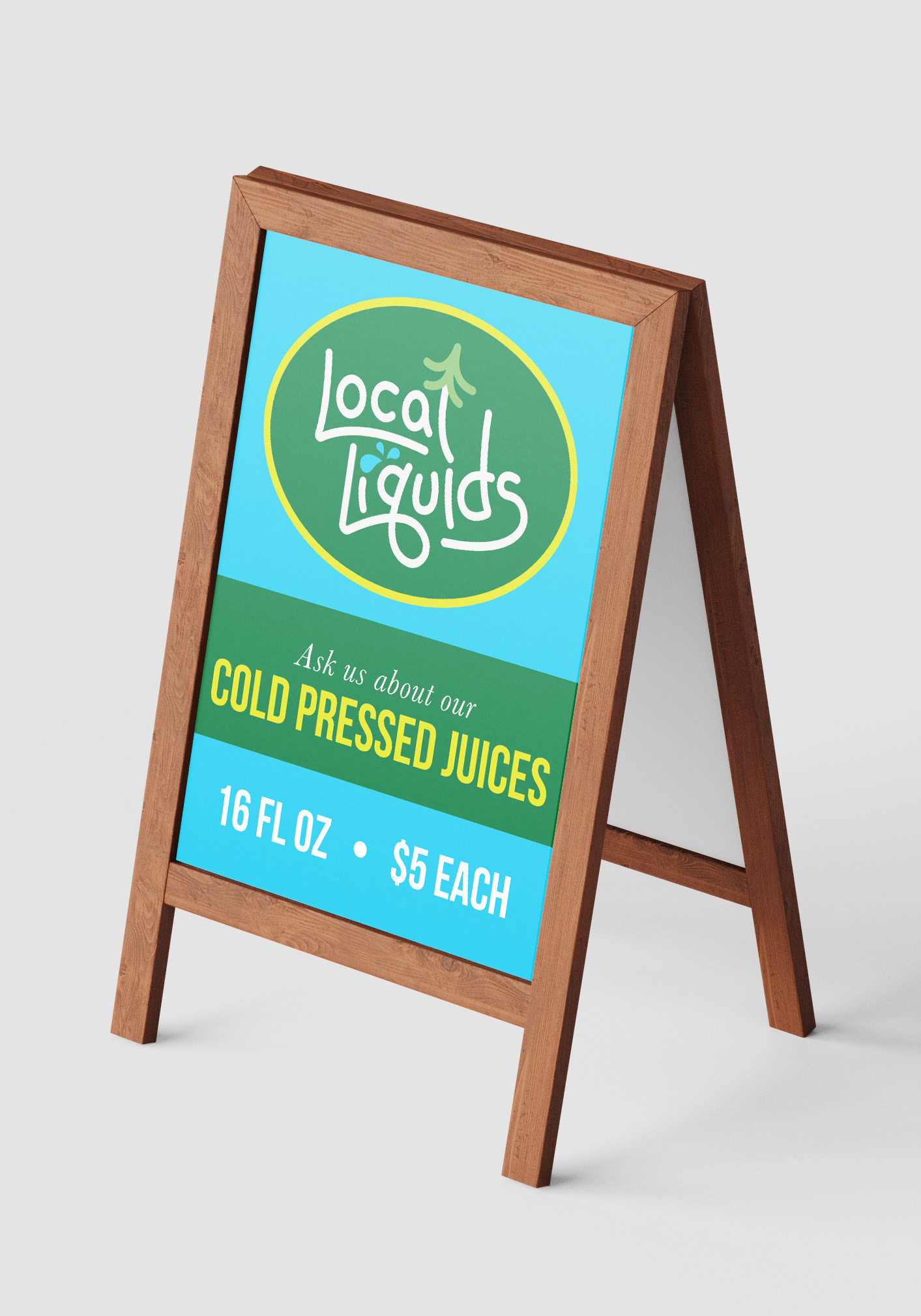
Local Liquids was seeking a logo that embodies the vitality and abundance of the Pacific Northwest. The goal was to use simple earth tones with a bright accent color and integrate natural elements like trees and water into a modern, circular layout. The logo should evoke a sense of home and health, appealing to a broad audience interested in personal vitality and natural refreshments.
Local Liquids was seeking a logo that embodies the vitality and abundance of the Pacific Northwest. The goal was to use simple earth tones with a bright accent color and integrate natural elements like trees and water into a modern, circular layout. The logo should evoke a sense of home and health, appealing to a broad audience interested in personal vitality and natural refreshments.
